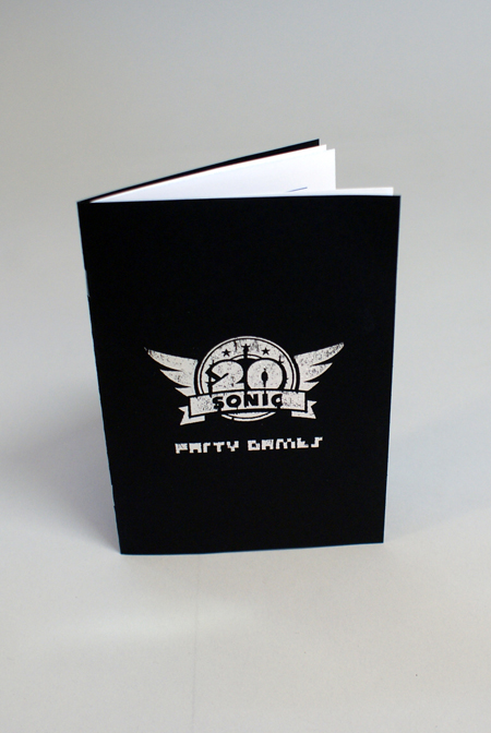
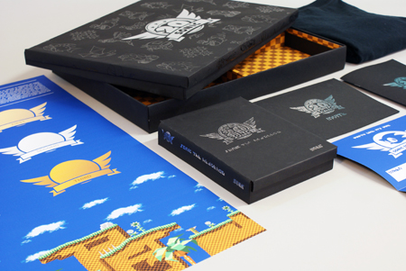
Moving on from yesterday, I used the nets that I hand drew to make the mock ups and put them into Illustrator. I went through a couple of variations to work out what would go together the best and how things were going to fit together.
We decided that while we want the outside of the box to look very subtle and classy, we want the inside of the box to relate directly to the games by use of colours and patterns, so, the image below is going to be used to line the box to make it very vibrant and colourful just like the game.
Using some high res images of a sonic level, I created these vectors using pantone colours so that they will print nicely. Being vectors, they can be resized to whatever I need them to be which is handy.
A vector image of the sky using Pantone colours to be used for the back of the pop up as something for the standing up pieces to be attached to and be shown in front of to make the level complete.
Photographs of my colour mock up minus the floor pattern.
I constructed the box out of greyboard and PVA glue rather than mountboard and paper because this box is quite sturdy and wrong and will be easy to wrap in whatever paper we choose to be on the outside. It was built around the dimensions of the original Megadrive box (Will's) to ensure that everything would fit nicely.
Rather than use A-format, we decided that we would make the 'league table' type poster 2:1 A3.
Which could fold down into A6 and this would be the size that we would aim to design the rest of the parts of the box around.
Will's logo development.
We each took home half of the characters to create line art for. Looking back at the design sheets we wanted these characters to be displayed subtly on the box while the logo took the centre stage. So using the line art of the original enemies, we created a pattern to be displayed behind the logo.
And here are some colour and style variations of the box. We're going to have a play around with screen print to finalize this.