


I decided to try and take my own hair textures so I got my housemate to sit still long enough for me to curl her hair and took some nice pictures of it. The curls look really good and I played with the contrast a little in photoshop to make the colour of her hair look really rich and luxurious. My own hair really isn't long enough to use for this.


I wanted a few other hair textures to play around with too and I never really thought to look on DeviantART for stock images before but it's actually brilliant for it. The pictures are huge and free as long as you credit the person they belong to. The blonde curls below belong to here.

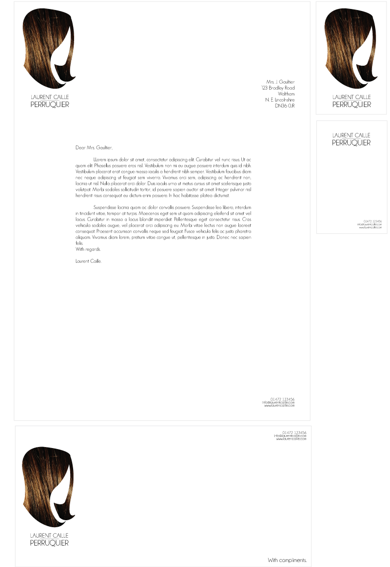
This brown hair texture I think is gorgeous and really rich in colour and texture and this one belongs to here.

The red hair texture belongs to here.

Drawing on the design sheets, I decided that I wanted to use the textures to make a hair shape, using clipping masks in Illustrator. I managed to draw a mannequin without too much trouble, I'm really not an illustrator. I managed to draw two simple hairstyles onto the mannequin without too much trouble. I tried my hand at something more extravagant and well, I'm not even going to post it on here. Let's just say it didn't work.


I started to apply my four textures to the hairstyles to see what worked the best. I have to say that when the texture is applied I much prefer the longer hairstyle to the shorter one. The shorter one looks less like hair than the other, so I'm going to go with the longer one.


I decided to see what it would look like with just the white mannequin shape against the solid hair texture. Doesn't really work for me and it's not obvious what it is.


However I did the same thing that I did before, making the hair shape out of the texture, though I got rid of the stroke around the mannequin so you can't see it, and can only see the shape of the hair. I think that this works really well and is something that I'm going to move forward with.


Out of all of the hair textures, I find that because the hairstyle is a straight one, the curly textures don't really work against it. If I had succeeded to draw a curly hairstyle, it might have worked, but it really didn't.


The typeface that I ended up going for was Champagne & Limousines which I found on dafont. I really like this typeface as it's both quite vintage and modern looking at the same time. It's interesting and I really like the tail of the Q.


I mocked up a letterhead using the brown hair style just to sort the layout and it was the first one that came to hand. I quite like the look of the body text being justified and brought inwards to line up with the edges of the logo and the address. It makes it easier to read because it brought it down to a comfortable amount of words per line without the text having to be massive. The contact details are also down in the bottom right corner which mirrors where they are placed on the business card.


For printing ease, I laid out the letterhead, compliments slip and business card all on the same sheet of A3 paper for both ease and to keep the cost of printing down. I'm going to print out all four textures so that I can see what they look like on paper and then I can make my final decision as to which one Im going to use though as of now, the red hair is still my favourite.


No comments:
Post a Comment