
Showing posts with label competition. Show all posts
Showing posts with label competition. Show all posts
Sunday, 12 December 2010

Saturday, 11 December 2010
Starpack: Milk

Now that things are starting to wind down for module hand in I found myself with a free couple of hours so I decided to have a crack at the Starpack brief that I was thinking about doing before. the brief is above from the website and reading through it, I figured that it was more of a conceptual brief than anything else and was only a minor brief. I wasn't going to do it but I found myself free so I did it.
Here's a few design sheets.


Out of all the ideas so far, I really like this idea of changing the shape of the normal milk carton so that they slot together. the advantages of this are that they take up less space and that way, far more can be transported and stored in one place, which vastly reduces the carbon footprint.


Here's a vector representation of the interlockable milk carton.

A few ideas using the chosen product name from the design sheets of 'Au Lait'. I didn't come up with a vast amount of variations for this because the clock is ticking and it's a brief that I want to turn around in a couple of hours. besides I really like the idea of using Ballpark font just touching the white edge. it's a font that looks like a milk splash. I used the conventional colours for milk packaging because if I go changing those around too much, I think that people will be confused. I prefer the images where the level of white is rising in response to the type of milk that it is packaging rather than staying in the same place on each carton.

A close up of each chosen carton front.


And 3D representations of all three.


Bish bash bosh. 2 hours.
Friday, 19 November 2010





Thursday, 18 November 2010
YCN: Sega - Day Four
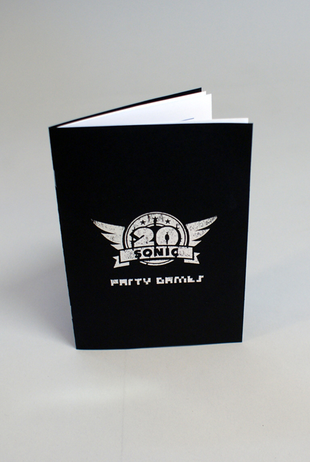
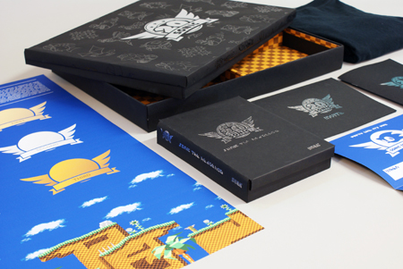
I spent the entire day putting this box together after we went to the drop in to print out the bits for the pop up. Will went off to design things such as invitations and posters while I was left in charge of the crafing. I find it quite therapeutic.
These are some 'in progess' shots of me working on it throughout the day.


The pop up was probably the most finicky thing to construct, and I managed to attach it to the back wall through using string and magic tale, which we will easily be able to photoshop out of the product shots.

 Tadaaa. It looks siiiiick.
These are some 'in progess' shots of me working on it throughout the day.


The pop up was probably the most finicky thing to construct, and I managed to attach it to the back wall through using string and magic tale, which we will easily be able to photoshop out of the product shots.


Wednesday, 17 November 2010
YCN: Sega - Day Three
We pretty much spent all day in screen print playing around with foils to try and get the effect that we wanted.
Showing the best one first, this is the design that we ended up choosing to go around the box. It doesn't use the blue that we originally wanted in our design sheets but they had a lovely black foil in the print rooms that we wanted to put on black paper to see how subtle an effect we could create. We really liked the black on black and didn't think that a gold logo would look quite right on it, so we went for silver foil instead. The 10th anniversary box set that was released for Sonic uses the blue and gold so we feel that this was a step away from that.


Here is the one that came in second place, using blue and gold, and a few other options too.


Showing the best one first, this is the design that we ended up choosing to go around the box. It doesn't use the blue that we originally wanted in our design sheets but they had a lovely black foil in the print rooms that we wanted to put on black paper to see how subtle an effect we could create. We really liked the black on black and didn't think that a gold logo would look quite right on it, so we went for silver foil instead. The 10th anniversary box set that was released for Sonic uses the blue and gold so we feel that this was a step away from that.


Here is the one that came in second place, using blue and gold, and a few other options too.


Subscribe to:
Posts (Atom)